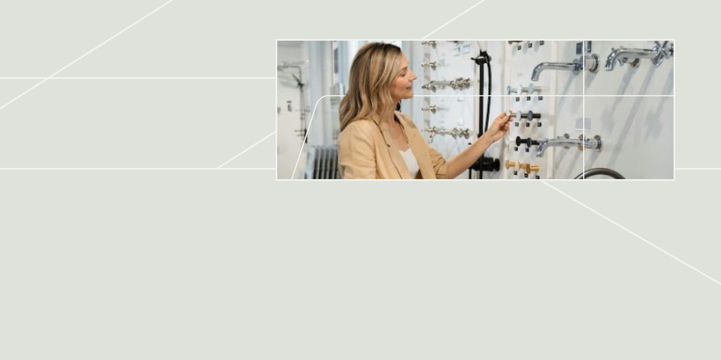
Industry Trends27 March 2024
4 Tips When Creating a Mood Board
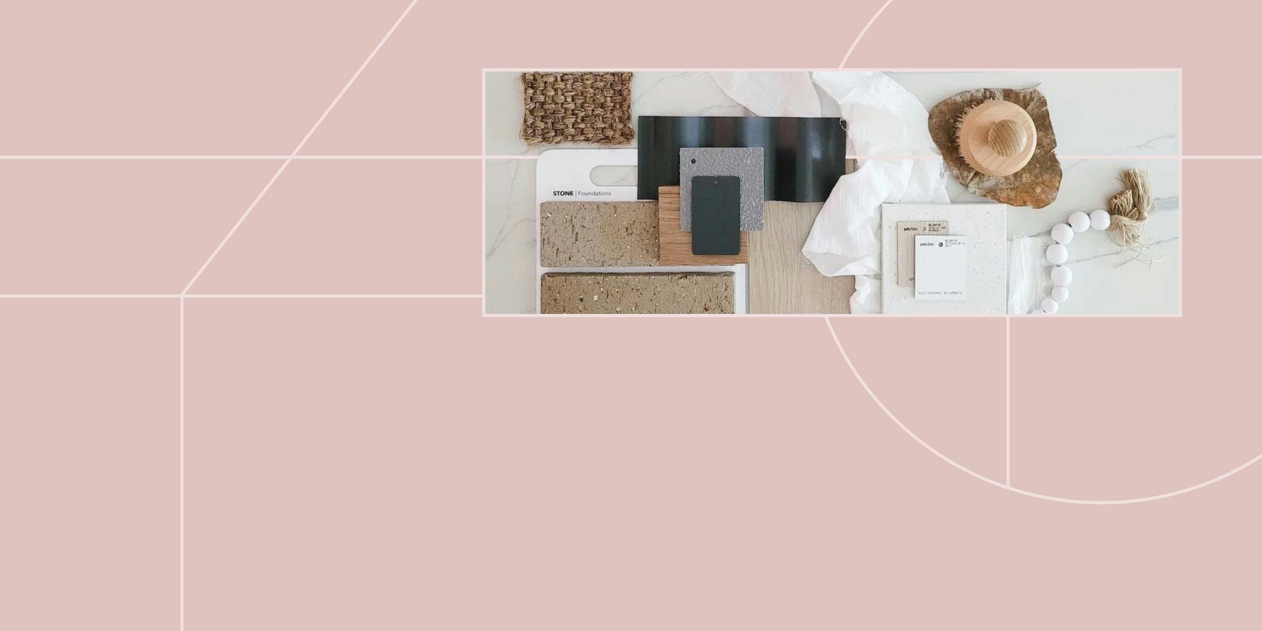
Learn how to create a mood board as the first step in your interior design project. From the software to use, to how to put it all together, we’ve got you covered.
Read more
Welcome to our online interior design blog, full of inspiration, the latest industry trends, alumni success stories, student work and more!
Looking for something specific?
- Industry Trends27 March 202427 March 2024
4 Tips When Creating a Mood Board
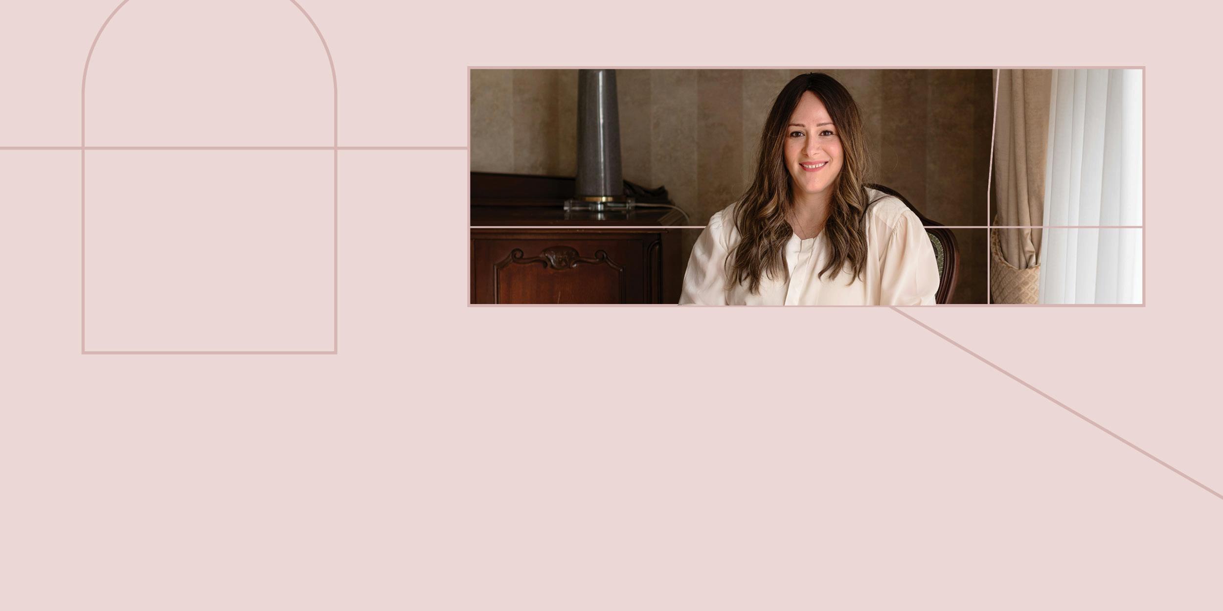
- Alumni Success12 March 202412 March 2024
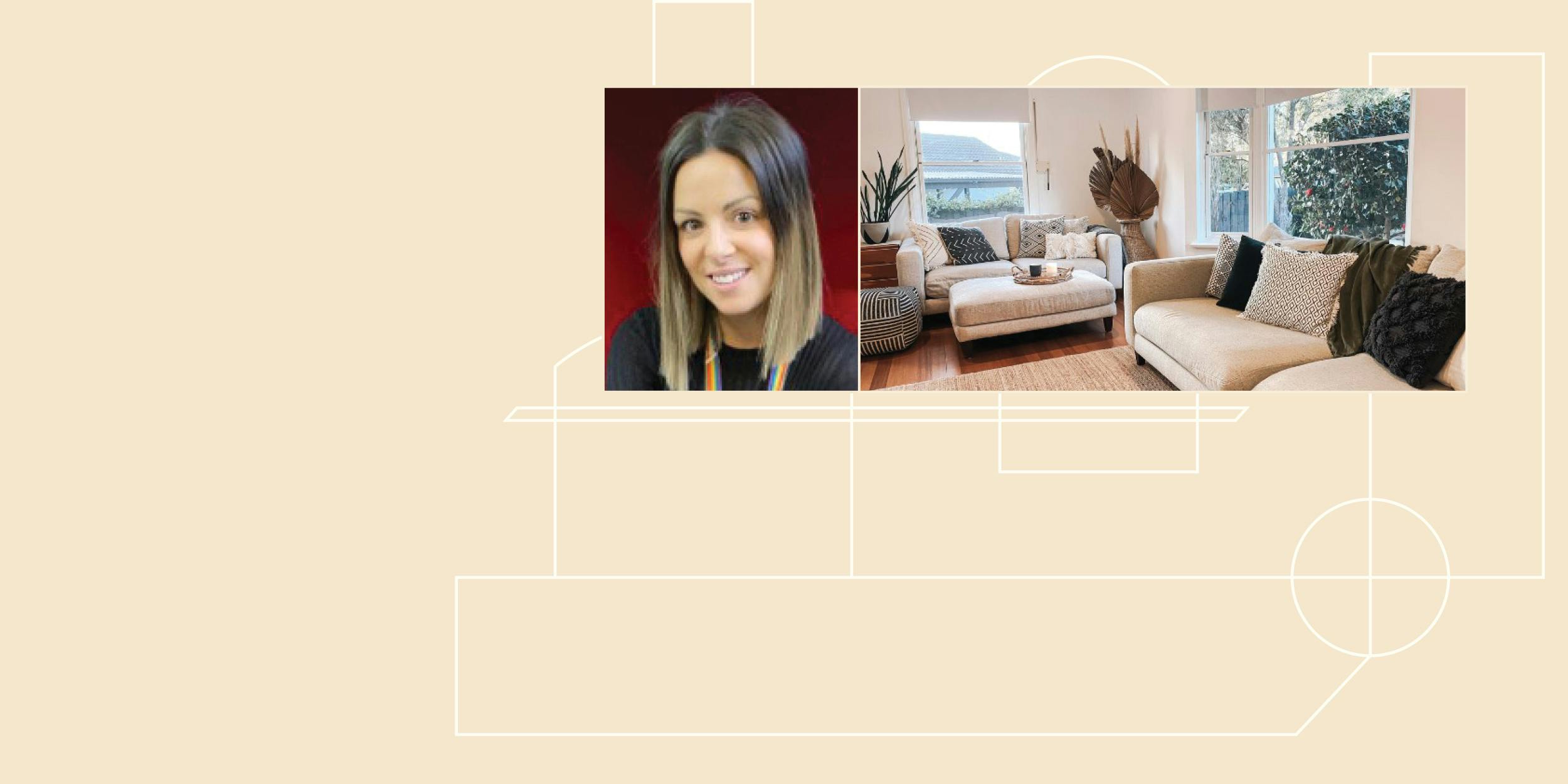
A Day in the Life of a Visual Merchandiser with Lisa Mathieson
- Alumni Success23 February 202423 February 2024
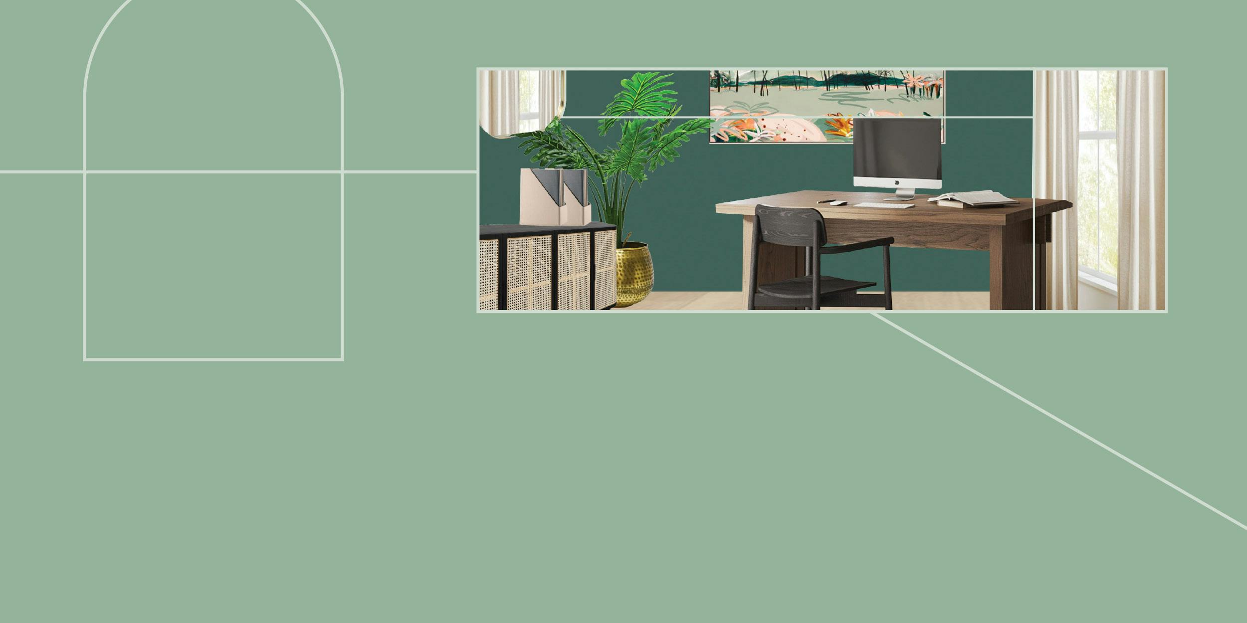
Styling Multi-Million Dollar Properties with Michelle Oliver
- Industry Trends13 February 202413 February 2024
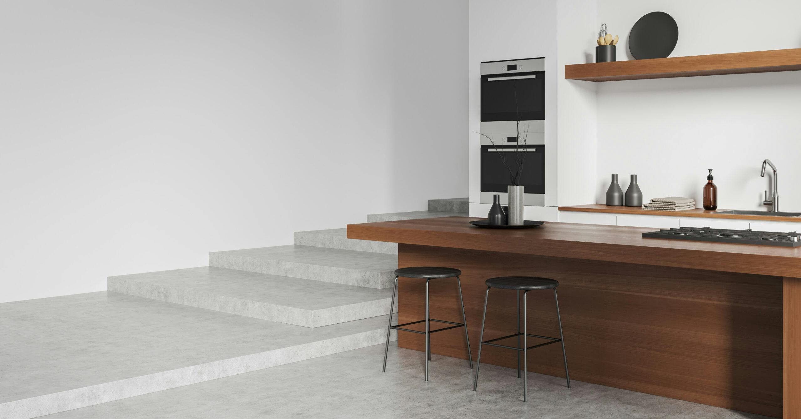
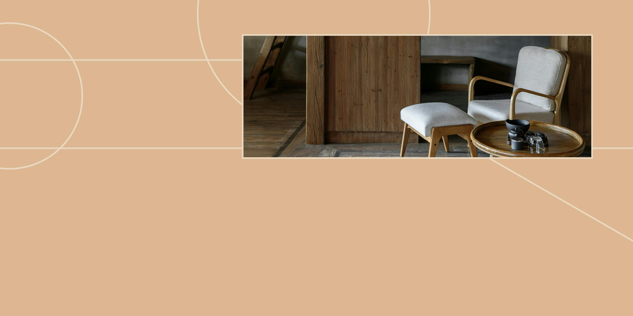
What is Japandi Interior Design?

Join Our Mailing List
Want to stay up to date with all the latest interior design news and events from ISCD? Enter your details and we’ll send you our monthly Design Fix newsletter as well as invites to our upcoming events.