Perceptions of Colour in Architecture: Q&A with Dulux’s Andrea Lucena-Orr

It really was a great evening, and a fantastic chance to catch an insightful presentation from a colour forecasting expert. With an enthusiastic audience, we were unable to answer everyone’s questions on the night, so here we have a recap of our Q&A with Andrea, who has generously returned the answers to many of your outstanding questions.
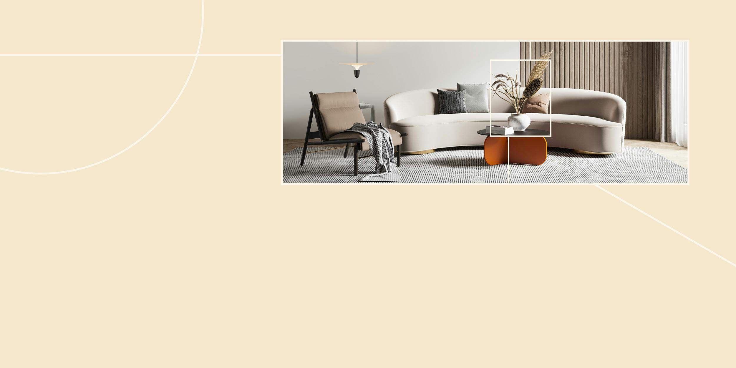
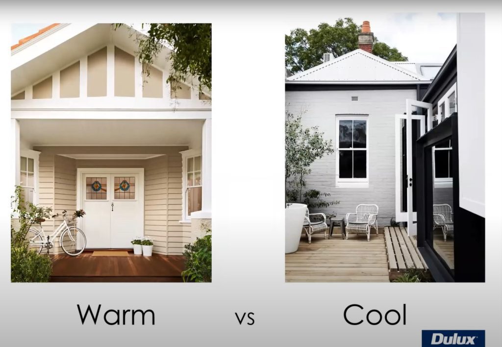
Q. There’s conflicting advice about the use of dark colours, ie. black, in rooms. Is it true that painting a room with a dark colour will make the room feel smaller?
A. I think that’s just nature’s way, because it’s not going to get the same light reflecting in a darker colour, it will always make it feel a little bit smaller, absolutely. But sometimes, that’s what you want.
So, if people are suggesting to you that they want a really cosy room that they feel really secure and safe in at night, and all of those words that give you that indicator that they want something that’s dark and moody, and that gives them that feeling as well – whereas if they say, ‘I want something that’s light and spacious’, obviously you know to go towards those lighter colours. There’s no right or wrong here, it’s about understanding what your client really wants the outcome to be.
Read: 5 Must-Have Skills to Work as an Interior Designer or Decorator
Want to watch Andrea’s presentation?
You can head over to ISCD’s YouTube channel to watch (or re-watch) Andrea Lucena-Orr’s presentation Perceptions of Colour in Architecture, as well as her bonus inclusion of the Dulux colour forecast for 2022!
Q. What are some tips and tricks to choosing ‘white’ when there are so many choices?
A. Comparing – that is the only way. So, understanding whether people are more attuned to the cooler side of the spectrum, or the warmer side, that will help… and then you can start comparing all of the warm whites against each other, or all of the cool whites against each other, because, obviously they all have their own undertones. Some of them will be quite stark on the cooler side, and then, they might be a little bit greyish, or they might be a little bit bluish, or on the warm side they might have a slight sort of yellowish or ochre undertone or it might be a little bit pinkish. So all of those will be identified when you start to work with your client.
When they have other materials to show you – it might be their favourite sofa, or their artwork that they’re working with if it’s an existing home, or if it’s a new home, or a new kitchen, or a new bathroom, it will be all of those materials that you’re building up to actually make that whole space, that draw out those undertones as well. So, if they’re spending $40,000 on a new kitchen, really, that’s what needs to shine. It’s those materials that need to shine, and the paint will just need to work with whatever those undertones are.
Q. If you want to darken your ceiling, what do you have to consider in terms of picking a colour – particularly black?
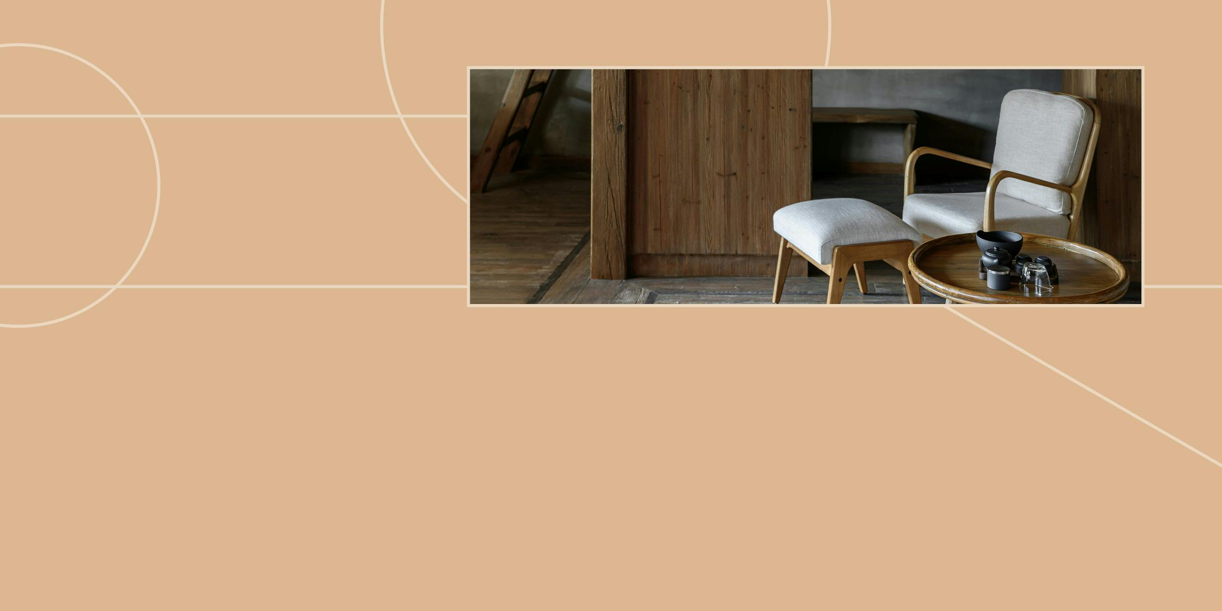
A. We’ve seen plenty of this done. In our Dulux Colour Awards, in particular, we see coloured ceilings quite often. You’ve just got to understand that to do black on the ceiling, there are two things you have to be mindful of. One of them is that the plasterboard has to be in really good condition, because the darker it is, the more you’ll see imperfections. The other thing to consider is it will make the room feel like the ceiling is lower. If it’s an old home, and you have really high ceilings, and you want that sense of something different, it’s a wonderful way to use colour, because it doesn’t overwhelm the space.
Years ago, it was done all the time. In the seventies and the sixties, it was a really common thing to have coloured ceilings, but from sort of the eighties onwards, we’ve started going white, and didn’t sort of ever get it back – but we’ve seen some fantastic examples of how it really works!
Q. Any tips to using white on white?
A. Putting two or three whites against each other – once you do that, you can actually see the undertone coming through. What you’ll see is, one might have a sort of a greyish undertone, next to something that might have a bit more of an ochre, next to something that actually brings out a bit of pink, and you’ll see that when you start comparing the colours together.
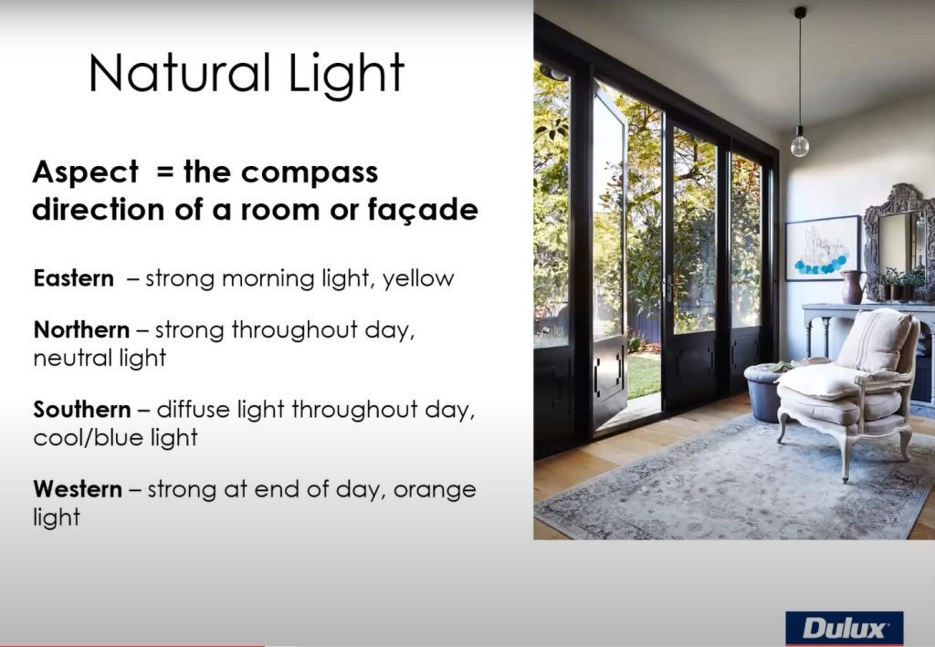
Q. Is there a best time of the day to see the undertones in the colours?
A. No, but there is a best aspect, and that is facing north. So if you do have any north facing spaces – or you can buy daylight tubes in fluoro at specialty stores like Phillips, who make a physical daylight tube, and that’s what we have in our conference rooms. But definitely facing that aspect of north will give you the most accurate colour.
But that is not reality, because not every room faces north, so you still have to understand how that colour will interact in every space.
Q. Quarter strength and half strength will also have an impact won’t they?
A. Absolutely, and that’s just to do with how much light is in the space. Often what people will do, is they might use Dulux Natural White™ on the walls, but they’ll use Natural White™ Half for the ceiling because they want it still in the same sort of warmth and everything, but they just want it a little bit lighter.
Q. I’m planning to paint the exterior of my house, and in WA we have extreme sunlight. Do the paints fade after time?
A. It depends on the colour. Just like Mother Nature tells you that red and yellow will always fade faster than other colours. But if you’re going for sort of mid-toned to light shades, especially on main walls, they’re not going to fade significantly.
At Dulux, we had new tinters developed in Australia, in our labs, and these tinters fade at the same rate. Because the issue with fade is that often one colour will fade much, much faster than another colour, and that’s where you start to see the differences. Our tinters have been made for our climate, and our environment and our weather.
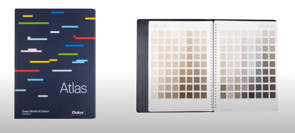
Q. We have a few questions regarding collateral. Could Andrea explain the process for ordering fan decks, the Atlas, A4 brush outs, etc? What is the minimum you would recommend starting out when doing a colour consult for a client? We get asked this a lot from our students!
A. At Dulux, we have a number of colour collateral tools. The number one is our Atlas, and everything comes from the Atlas. So, that’s our largest tool that we have on offer, which has about, over 4,800 colours, so more than you’ll ever need to use. And then, from there, we have a subset, which is about 2,800 colours in a fan deck. So it has all of your whites, your neutrals, your greys, all of those main, staple colours, but then it only has about half of those spectrum colours. Especially a great tool when you’re going out on site with a client, because you don’t necessarily want to drag a huge Atlas to someone’s home.
Everything that we have is available on our online shop, so you can actually purchase these tools. We do have the Atlas online, if people just want to use that initially, but also, if you have an ABN, you can access our free A4 collateral online as well. So, everything in that Atlas has an A4 sample.
Q. How many coats of paint are recommended to represent or bring out a particular colour to its fullest?
A. If the surface is undercoated or primed we would normally recommend two coats of top coat. For cleaner, more saturated colours you may be required to do more coats.
Q. What whites and greys are the most popular in the Dulux range?
A. The most popular whites are Dulux Natural White™, Lexicon® Quarter and Antique White U.S.A.® The most popular greys include, Dulux Grey Pail, Timeless Grey, Tranquil Retreat and Dieskau, and Domino.
Q. When looking at the Dulux Atlas how do we identify the undertone? Is this by the code on each swatch?
A. The easiest way to identify the undertone in the Dulux Atlas is to keep in the same column. This mainly works from pages 1-49 which are the colour spectrum pages.
Q. Is there anything in particular to consider on a fibro house?
A. The most important thing is to use a quality preparation product as fibro houses tend to be quite porous surfaces. Once the surface is primed correctly, if you use a product such as Dulux Weathershield® most colours should be able to cover in two coats.
Q. Is the Snapshot tool coming back?
A. At this stage we don’t have access to this product.
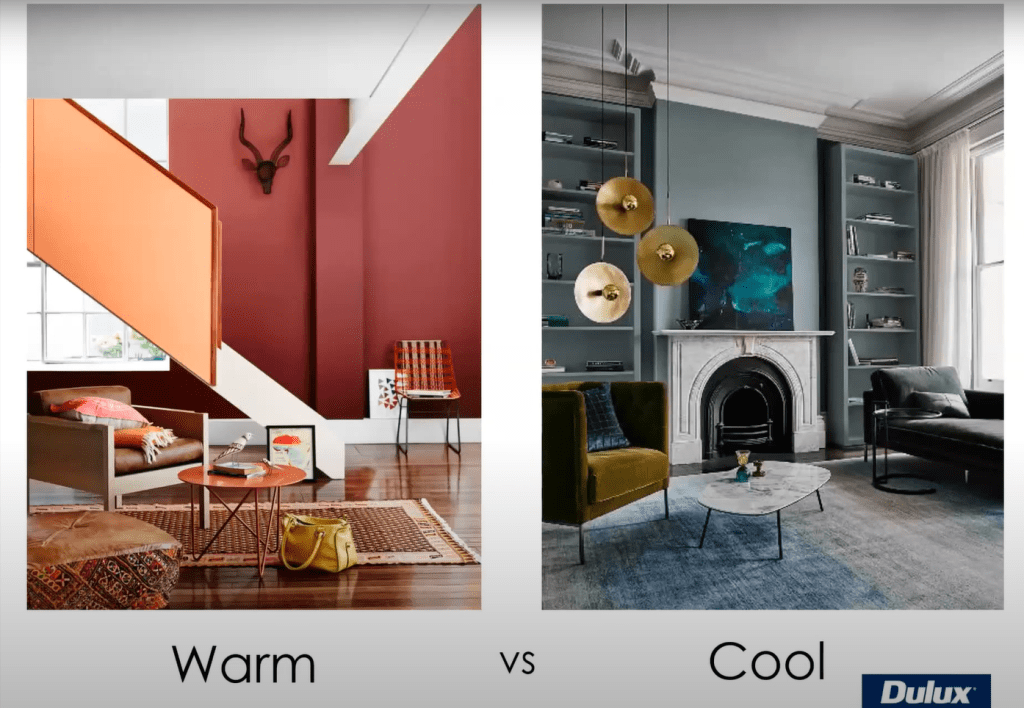
Q. Are there any basic rules of colour that we should be aware of?
A. There aren’t really any general rules around colour – it really always depends on the project at hand. For interiors, you need to consider other materials or fixtures/fittings you need to work with and for exteriors the other building materials such as bricks, tiles, pavers, etc.
Q. Does Dulux have a separate fan deck for low VOC paints and special finishes?
A. We don’t have a separate fan deck. Dulux Wash&Wear® is a low VOC paint and comes in all Dulux colours. For our lowest VOC paint – Dulux UltraAir® is available in many Dulux colours from a white base.
Q. What’s the best white for ceilings?
A. It’s a hard one, because obviously, this depends on whether you’re using a cool palette or a warm palette. What I say to people is, if you’re really not sure, often it’s better to keep in the same tone. So if you want to use something like Lexicon® on the walls, you might want to use Lexicon® Half or Lexicon® Quarter on the ceilings. Then at least it stays in that cooler spectrum of white – you’re not changing it up too much. A lot of people use Vivid White™, which is simply our ceiling white. It’s our purest white and it goes with just about anything. But often now what people are doing is they’re using a half strength of the wall colour. So even if they were going to use something like Natural White™ on the walls, or Snowy Mountains Half, or something, they might use Snowy Mountains Quarter on the ceiling. So, keep it once again, in that same sort of undertone.
Q. Was there any particular trend in colour during the really rough, nasty part of the lockdown when everybody went into DIY mode?
A. Whenever times are rough, we always go back to brown as our base colour. So the last ten years, or last decade, prior to a couple of years ago, we had grey as our base stable. Everything had a grey base – give or take a few things.
We noticed about three years ago, that we started to see things warming up a little bit, and the greys were getting more greige, so they were going more towards that beige sort of scale, with that browner undertone. And we certainly saw that come through much more strongly, because brown is a security colour. Brown is earth, it’s our grounding colour, so hence why everything warms up when times are, you know, grim.
ISCD has a 40-year proven track record of producing leading Australian interior designers. We know design intimately, from colour theory, to furniture selection to the latest industry trends.
Are you interested in studying interior design or decoration? Do you want to know more about our online courses and where a career in interior design could take you? Connect with us today to learn more about our Diploma of Interior Design, the Certificate IV in Interior Decoration or any of our industry-focused microcredentials.